




Le Signe
July 2023
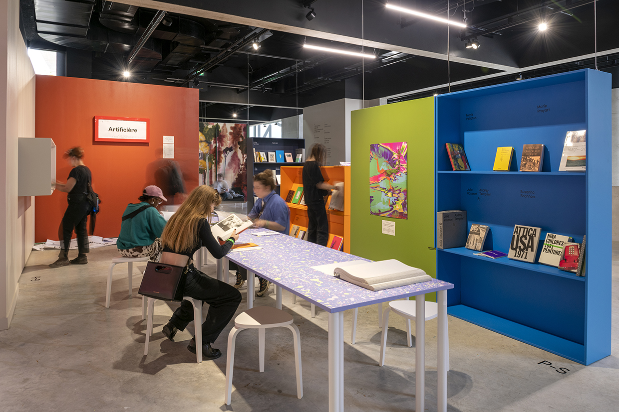
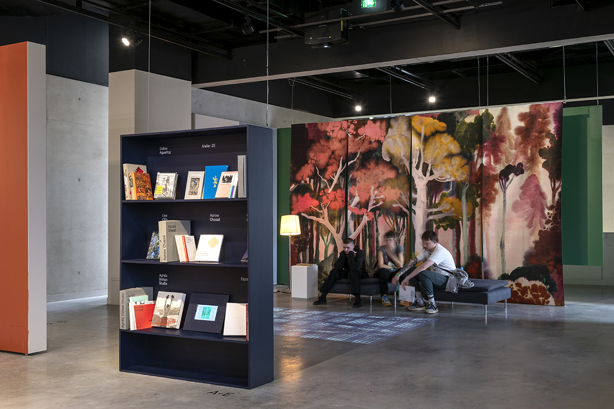
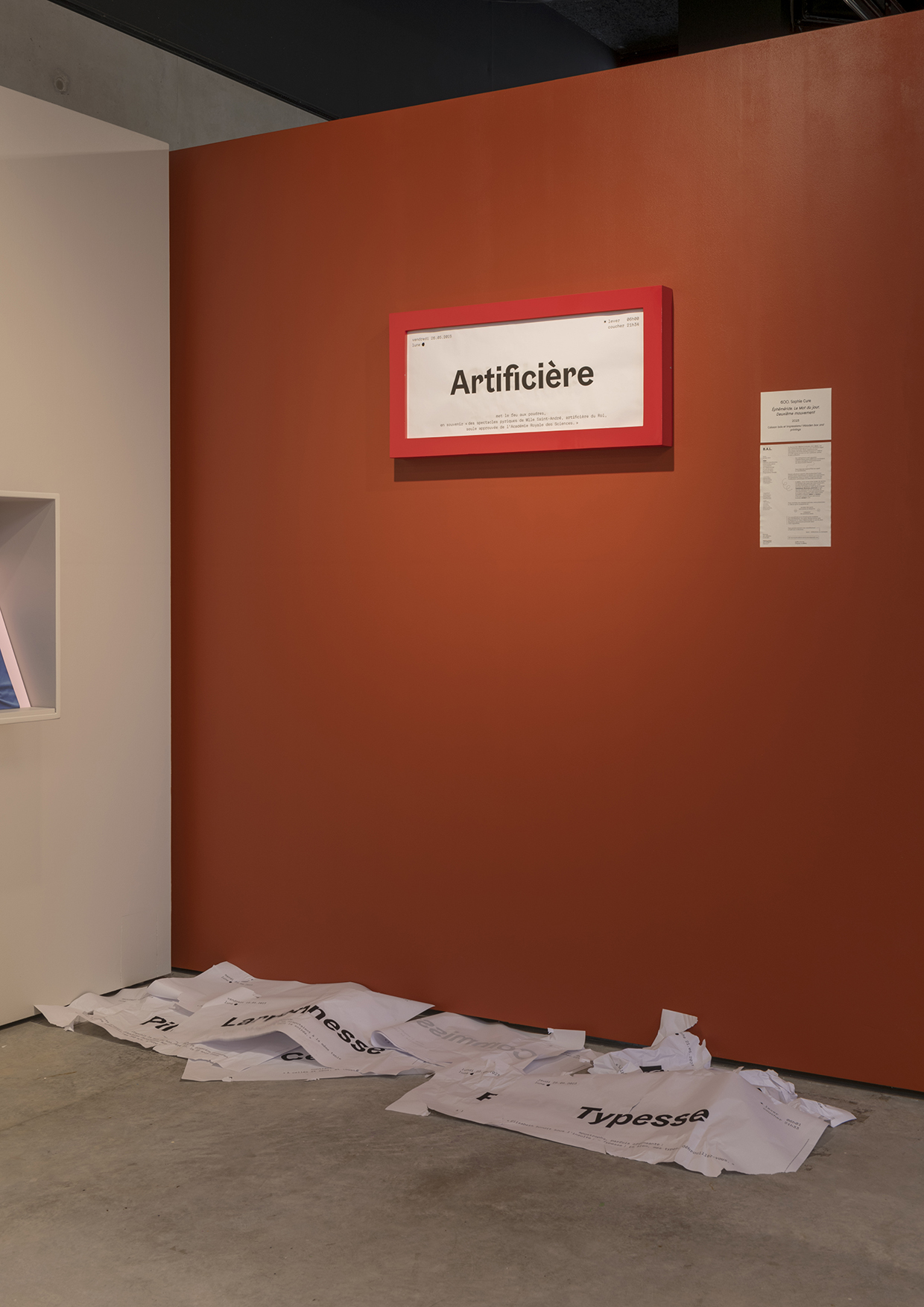
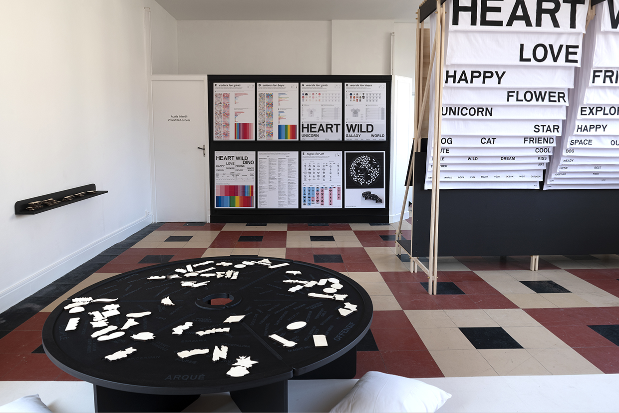
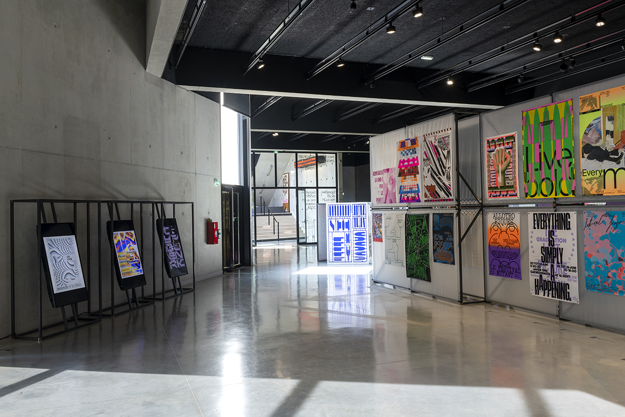
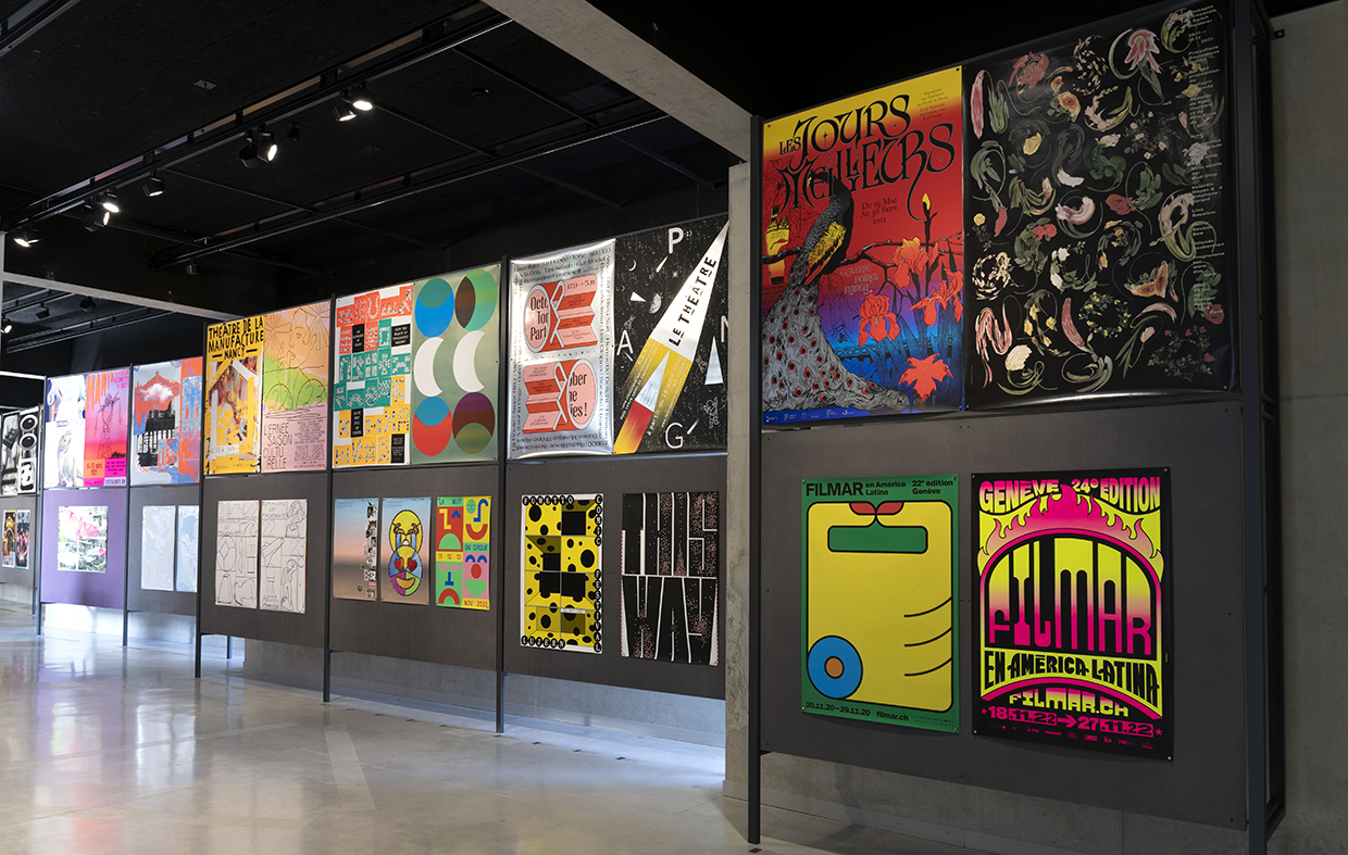
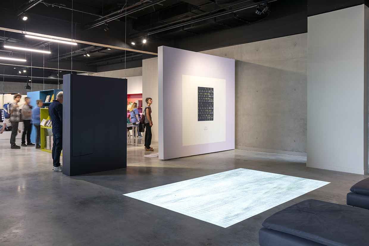
Jean-Michel Géridan is the director of Le Signe, the National Center for Graphic Design in Chaumont. From 22 May to 21 October, 2023, le Signe is organizing its 4th International Biennial of Graphic Design, with a special edition for the 30th International Poster Competition of Chaumont.
Temple Magazine
What are the main missions and activities of le Signe, the National Center for Graphic Design in Chaumont?
Jean-Michel Géridan
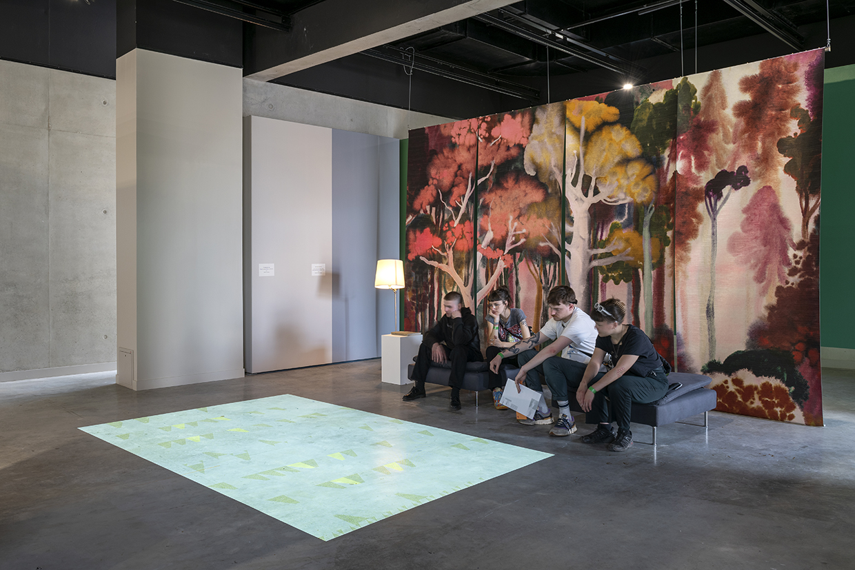
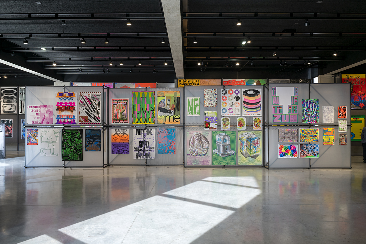
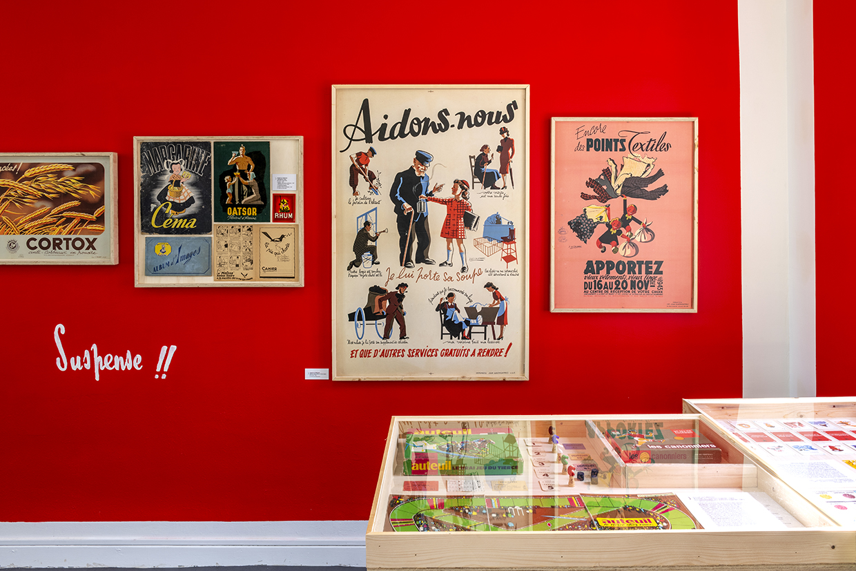
Le Signe is, by definition, a center for contemporary art, with four essential missions: to support contemporary creation, to share knowledge through transmission; mediation; and diffusion. The history of Chaumont began in 1906 when a collector bequeathed half of his collection of posters, books, magazines, and graphic objects (such as matchboxes) to the city. Rediscovered 90 years later, it was found to comprehend a very large ensemble of Jules Chéret's posters and, above all, the largest collection of Toulouse-Lautrec's posters in a remarkably preserved state. This collector was part of a movement called "affichomaniac." At the time, illustrated posters had just appeared, and he was such a fan that he used a spatula to remove them from the walls of Paris, and that's how his collection started. In 1990, the movements launched by French president François Mitterrand in1981, known as decentralization laws, began to establish. It was recognized that culture should not be concentrated solely in Paris, and each city was encouraged to have a kind of label or distinction. At that time, an archivist from the city of Chaumont discovered this collection of books and posters, which was then appraised and already set Chaumont on the path of becoming a city of graphic design in France. The first artistic director of the poster festival collaborated with Grapus and artistically piloted the festival together. There were 25 years of professional meetings at that time, known as "rencontres des arts graphiques" (graphic arts meetings). The State, the region, and the city thought it would be interesting to have a permanent venue dedicated to graphic design, something that didn't exist in France at all. In 2023, with this fourth edition of the biennial, we see that it is now understood, even by the public, that graphic design cannot be limited to just posters. Our desire is not to be a museum that preserves, but to be as close as possible to what’s happening today.
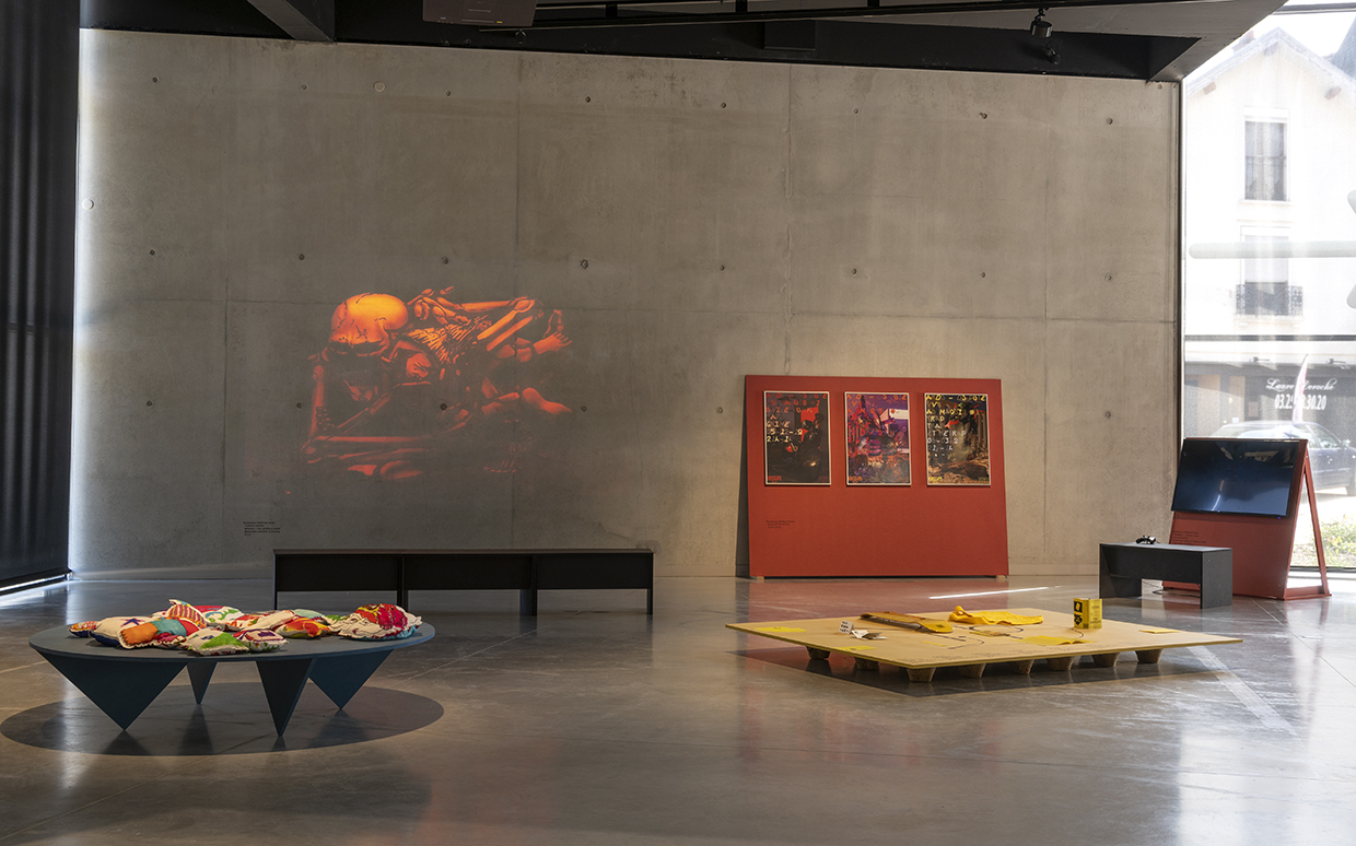
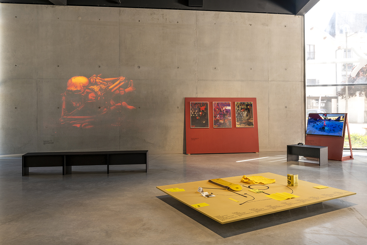
I arrived for the second year of the art center, and the project was to showcase all possible forms, including a project where you took part, which is the Prix unique du livre. The simple observation was that not everyone creates posters, and to show only that would discriminate a significant part of the profession. Now, the International poster competition, which used to take up almost all the space, coexists with other forms today.
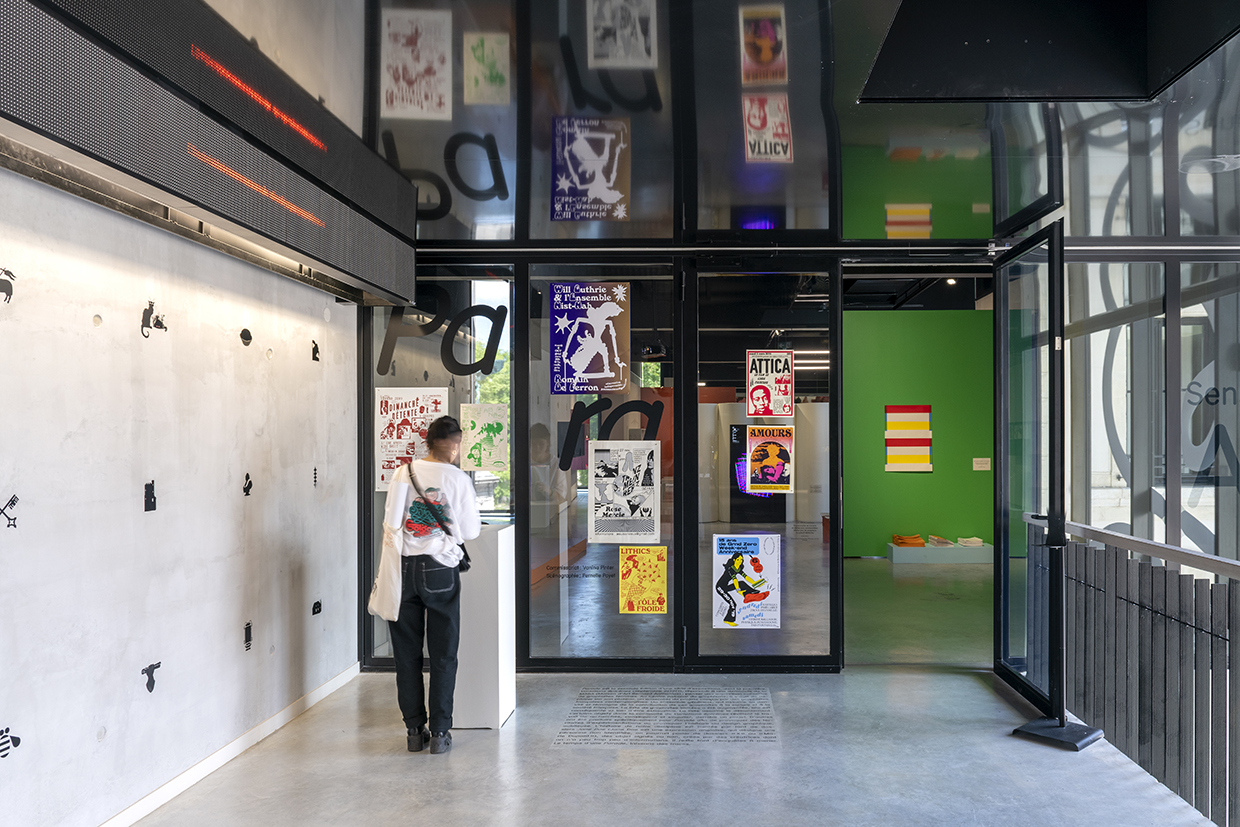
About coexistance , Le Signe never has the same logo. It's a mark that has a certain size, and each guest can appropriate it because I know some friends, whom I would describe as punk or indie, refuse to be associated with institutions. Likewise, some big brands sometimes don't want to be associated with us. One of the tricks we found is that when you are invited, you are invited to change the logo. We try to make it a fairly open and welcoming place, and nowadays, very few people refuse our invitations. The only refusals we get are from people who are not ready to come right away because the place is quite vast and impressive. There is the fear of criticism and of messing up. Le Signe is a place that tries to adapt to each invitation.
Temple Magazine
What are the specificities of the competitions organized during the 2023 Biennial?
Jean-Michel Géridan
Regarding the graphic design biennial, 2023 is the fourth edition, but it is the thirtieth edition of the poster competition. Since I've been here, I've been working on the visual identity with Mathias Schweizer because the institution didn't have one. I really wanted to create a cake and use the analogy of taste, simply for two reasons. In any circle, at some point, you invite more or less the same people. There's this metaphorical idea about the slice of the cake: who gets more and who gets less? The fact is that there was an issue of gender representation in the program. To give you a simple example, over the 24 years of the festival, out of 24 editions, there were only three women involved. It was something I wanted to address. In the cake, like at any party, there are people who are not invited, and I thought: let's to invite everyone and give everyone their share. I also worked a lot in education and was the director of an art school. I don't know if you noticed when you were students, but Western statistics show that 70% of art school students are women, and only about 1% become independent artists. There are phenomena of evaporation, as the curator Vanina Pinter puts it. With our mission to support creation, transmission, mediation, and diffusion, we need to be very diverse. Something I've learned over time is that personal taste should not dictate curating when it aims to be eclectic. It is a mission of public service, and I refer a lot to the french constitution regarding the right to education and access to culture, which many people have forgotten.
Temple Magazine
Can you tell us more about the Parade exhibition by Vanina Pinter?
Jean-Michel Géridan
The first edition took place at the Maison d'art Bernard Anthonioz, which dedicates an annual exhibition for graphic design, but there were no women involved. In 2020, they invited Vanina Pinter, who presented the exhibition "Variations épicènes" with about thirty artists, and then the COVID-19 pandemic struck. The exhibition lasted less than two weeks and disappeared into oblivion. So, I invited her to bring the exhibition to Le Signe, as part of the biennial. There are artists I adore who are unjustly invisible. For example, Sylvia Tournerie, who was part of the French Touch, and never mentioned in retrospectives. I'm not saying that she's bothered by this situation, but at some point, the choices made by few historians, and publishers, also determine whether someone enters history or not. There are not enough heroines in the “official” history of art; it's a very linear narrative, and that's something that really concerns us, especially in the graphic design field.
Temple Magazine
By coexisting with Le Signe, how is the city of Chaumont involved in developing and promoting graphic design in France?
Jean-Michel Géridan
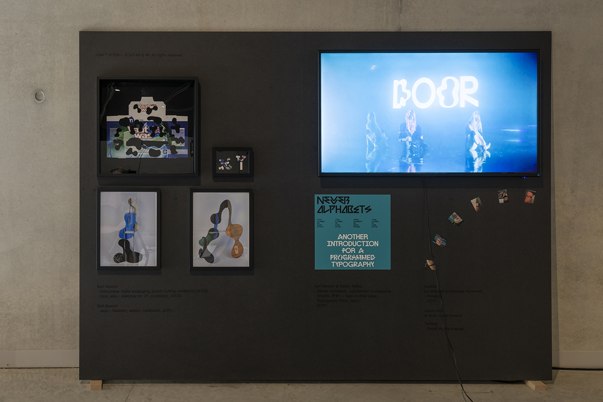
The city of Chaumont is the first partner, even financially, of Le Signe. In this famous territorial marketing, Chaumont has defined itself as the city of posters, but you can see while walking around the streets that it's somewhat subtle. There isn't even a signage indicating that Le Signe exists. One of the current mayor's intentions was to say: well, we have a lot of renovations to do in buildings; wouldn't it be time to deploy a visual identity, not only for municipal services but also for all citizens and associations, and establish a typeface called "Chaumont" so that people can adopt it? The mayor is very interested in systems of redistribution, and this typeface, designed for the city and becoming the identity of all municipal buildings, is free for all to use. Although not Open Source, it cannot be modified, but it was made free of charge for all uses, so that everywhere, Chaumont is known as the city of graphic design in France. Even if it's not immediately visible on the city itself, Chaumont will travel around like this and assert its identity. We offer a toolbox to graphic designers all over the world and to all enthusiasts, as a friendly and benevolent object. We, at Le Signe, are not associated with this project, and it's even more exciting to see that we are on a territory that is on the same wavelength as us and takes the relay in another way. The other surprising thing about the typeface is that part of the character design by Baldinger•Vu-Huu for Chaumont is also an observation of the posters from the Belle Époque, where people allowed themselves completely impossible lettering, and you really had to decipher them to read them.
We forget that at the Belle Époque, the literacy rate was very low, yet people managed to read the messages. And today, when we say that education is mandatory, and our harshest critics come from people who have lost all sense of curiosity and stopping. For these critics, the message must arrive quickly and be striking. This also raises other problems in graphic design in France; it seems that clients have forgotten to trust the artists. Sometimes the specifications are so restrictive that it becomes very complicated to produce high-quality images because you have to cram in as much as possible all the time and still have a visual impact.
We are fortunate that the International poster competition is not a competition of the cream of the crop of graphic designers, and the jury makes a selection, so some great things were overlooked. That's why the next exhibition will be dedicated to those who barely made it, because some very good things didn't make the final cut since we had to choose only 100 posters. Also, it's not an exhibition of the “best” graphic designers, but almost of the greatest commissioners because where there is artistic and visual freedom of expression, it's because the client is there to trust. What's important is not so much to say, "I don't like the font or the color," but to understand where the client could go and to trust the artistic expertise of the designers. The graphic identities that have worked best in France are those where the commissioner has committed to the graphic designer for a long time.
 Temple Magazine
What are the main missions and activities of le Signe, the National Center for Graphic Design in Chaumont?
Jean-Michel Géridan
Le Signe is, by definition, a center for contemporary art, with four essential missions: to support contemporary creation, to share knowledge through transmission; mediation; and diffusion. The history of Chaumont began in 1906 when a collector bequeathed half of his collection of posters, books, magazines, and graphic objects (such as matchboxes) to the city. Rediscovered 90 years later, it was found to comprehend a very large ensemble of Jules Chéret's posters and, above all, the largest collection of Toulouse-Lautrec's posters in a remarkably preserved state. This collector was part of a movement called "affichomaniac." At the time, illustrated posters had just appeared, and he was such a fan that he used a spatula to remove them from the walls of Paris, and that's how his collection started. In 1990, the movements launched by French president François Mitterrand in1981, known as decentralization laws, began to establish. It was recognized that culture should not be concentrated solely in Paris, and each city was encouraged to have a kind of label or distinction. At that time, an archivist from the city of Chaumont discovered this collection of books and posters, which was then appraised and already set Chaumont on the path of becoming a city of graphic design in France. The first artistic director of the poster festival collaborated with Grapus and artistically piloted the festival together. There were 25 years of professional meetings at that time, known as "rencontres des arts graphiques" (graphic arts meetings). The State, the region, and the city thought it would be interesting to have a permanent venue dedicated to graphic design, something that didn't exist in France at all. In 2023, with this fourth edition of the biennial, we see that it is now understood, even by the public, that graphic design cannot be limited to just posters. Our desire is not to be a museum that preserves, but to be as close as possible to what’s happening today.
I arrived for the second year of the art center, and the project was to showcase all possible forms, including a project where you took part, which is the Prix unique du livre. The simple observation was that not everyone creates posters, and to show only that would discriminate a significant part of the profession. Now, the International poster competition, which used to take up almost all the space, coexists with other forms today.
About coexistance , Le Signe never has the same logo. It's a mark that has a certain size, and each guest can appropriate it because I know some friends, whom I would describe as punk or indie, refuse to be associated with institutions. Likewise, some big brands sometimes don't want to be associated with us. One of the tricks we found is that when you are invited, you are invited to change the logo. We try to make it a fairly open and welcoming place, and nowadays, very few people refuse our invitations. The only refusals we get are from people who are not ready to come right away because the place is quite vast and impressive. There is the fear of criticism and of messing up. Le Signe is a place that tries to adapt to each invitation.

Temple Magazine
What are the specificities of the competitions organized during the 2023 Biennial?
Jean-Michel Géridan
Regarding the graphic design biennial, 2023 is the fourth edition, but it is the thirtieth edition of the poster competition. Since I've been here, I've been working on the visual identity with Mathias Schweizer because the institution didn't have one. I really wanted to create a cake and use the analogy of taste, simply for two reasons. In any circle, at some point, you invite more or less the same people. There's this metaphorical idea about the slice of the cake: who gets more and who gets less? The fact is that there was an issue of gender representation in the program. To give you a simple example, over the 24 years of the festival, out of 24 editions, there were only three women involved. It was something I wanted to address. In the cake, like at any party, there are people who are not invited, and I thought: let's to invite everyone and give everyone their share. I also worked a lot in education and was the director of an art school. I don't know if you noticed when you were students, but Western statistics show that 70% of art school students are women, and only about 1% become independent artists. There are phenomena of evaporation, as the curator Vanina Pinter puts it.
With our mission to support creation, transmission, mediation, and diffusion, we need to be very diverse. Something I've learned over time is that personal taste should not dictate curating when it aims to be eclectic. It is a mission of public service, and I refer a lot to the french constitution regarding the right to education and access to culture, which many people have forgotten.
Temple Magazine
Can you tell us more about the Parade exhibition by Vanina Pinter?
Jean-Michel Géridan
The first edition took place at the Maison d'art Bernard Anthonioz, which dedicates an annual exhibition for graphic design, but there were no women involved. In 2020, they invited Vanina Pinter, who presented the exhibition "Variations épicènes" with about thirty artists, and then the COVID-19 pandemic struck. The exhibition lasted less than two weeks and disappeared into oblivion. So, I invited her to bring the exhibition to Le Signe, as part of the biennial. There are artists I adore who are unjustly invisible. For example, Sylvia Tournerie, who was part of the French Touch, and never mentioned in retrospectives. I'm not saying that she's bothered by this situation, but at some point, the choices made by few historians, and publishers, also determine whether someone enters history or not. There are not enough heroines in the “official” history of art; it's a very linear narrative, and that's something that really concerns us, especially in the graphic design field.

Temple Magazine
By coexisting with Le Signe, how is the city of Chaumont involved in developing and promoting graphic design in France?
Jean-Michel Géridan
The city of Chaumont is the first partner, even financially, of Le Signe. In this famous territorial marketing, Chaumont has defined itself as the city of posters, but you can see while walking around the streets that it's somewhat subtle. There isn't even a signage indicating that Le Signe exists. One of the current mayor's intentions was to say: well, we have a lot of renovations to do in buildings; wouldn't it be time to deploy a visual identity, not only for municipal services but also for all citizens and associations, and establish a typeface called "Chaumont" so that people can adopt it? The mayor is very interested in systems of redistribution, and this typeface, designed for the city and becoming the identity of all municipal buildings, is free for all to use. Although not Open Source, it cannot be modified, but it was made free of charge for all uses, so that everywhere, Chaumont is known as the city of graphic design in France. Even if it's not immediately visible on the city itself, Chaumont will travel around like this and assert its identity. We offer a toolbox to graphic designers all over the world and to all enthusiasts, as a friendly and benevolent object. We, at Le Signe, are not associated with this project, and it's even more exciting to see that we are on a territory that is on the same wavelength as us and takes the relay in another way. The other surprising thing about the typeface is that part of the character design by Baldinger•Vu-Huu for Chaumont is also an observation of the posters from the Belle Époque, where people allowed themselves completely impossible lettering, and you really had to decipher them to read them. We forget that at the Belle Époque, the literacy rate was very low, yet people managed to read the messages. And today, when we say that education is mandatory, and our harshest critics come from people who have lost all sense of curiosity and stopping. For these critics, the message must arrive quickly and be striking. This also raises other problems in graphic design in France; it seems that clients have forgotten to trust the artists. Sometimes the specifications are so restrictive that it becomes very complicated to produce high-quality images because you have to cram in as much as possible all the time and still have a visual impact. We are fortunate that the International poster competition is not a competition of the cream of the crop of graphic designers, and the jury makes a selection, so some great things were overlooked. That's why the next exhibition will be dedicated to those who barely made it, because some very good things didn't make the final cut since we had to choose only 100 posters. Also, it's not an exhibition of the “best” graphic designers, but almost of the greatest commissioners because where there is artistic and visual freedom of expression, it's because the client is there to trust. What's important is not so much to say, "I don't like the font or the color," but to understand where the client could go and to trust the artistic expertise of the designers. The graphic identities that have worked best in France are those where the commissioner has committed to the graphic designer for a long time.